Usability Heuristics
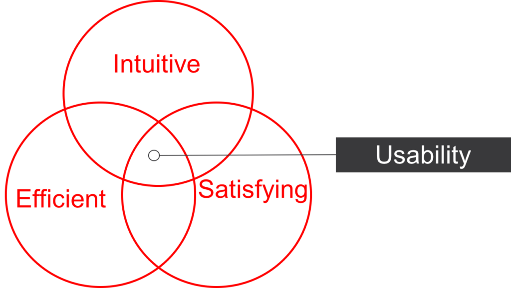
Usability Heuristics are a set of principles from Human Factors and Human Computer Interaction (HCI) that provide guidance on creating user interfaces that are naturally intuitive, efficient and satisfying. Jacob Neilson proposed a set of 10 principles that can be used for guiding and evaluating the creation of new user interfaces. Those principles are as follows:
1. Visibility of System Status – The user needs to have awareness of what is going on. For example, showing a status wheel that something is loading instead of a blank screen. Or better yet, showing what percent of load is completed. This enables the user to make decisions and feel more in control of their experience.
2. Matching System and Real World – The system needs to match the concepts, language and messaging that are reflective of the end-user. This is often a problem in systems designed by engineers of graphic designers who are not aware of the workflow and who lack the depth of specific domain knowledge.
3. User Control and Freedom – This rule assumes that users frequently click the wrong button and thus need an easy way to get out of the new sequence they’ve just initiated. I’m sure we’ve all experienced clicking the wrong button and feeling like we’ve been punished for our mistake as we wait for the system to finish whatever it must do next, or even start over, or lose data. The goal here is once again to put the user in control of their experience.
4. Consistency of Standards – The system should be designed in a way that it is obvious and self-documented in nature. This means using simple and consistent labeling, messaging, and visual clues. It also helps that the visual clues and labeling clues are selected carefully to help communicate the proper things. Proper use of colors can also be helpful here (red for stop or error, green for go or success).
5. Error Prevention – A careful evaluation of use cases should be undertaken to look for opportunities for error in the use for the system and then to revise the design to remove or minimize the error. Often times, messaging is not enough since people rarely read unless they are stuck and already experiencing the error. Instead, look to minimize options and complexity and reconcile any conflicting messaging or clues.
6. Recognition Rather Than Recall – The system should be immediately obvious, then user should not have to learn how to use it. If there is a steep learning curve, there is something fundamentally wrong. The one exception here might be if the user lacks the specific domain knowledge for which the workflows were designed. otherwise, there should not be the need to learn or remember how the interface works.
7. Flexibility and Efficiency of Use – When designed well, the system will provide shortcut options for power users who understand the system well and no longer need the thoroughly composed user interface to perform their activities. For example, most modern desktop software will provide shortcut keys to print, saving, cut, and copy, reducing the steps needed to perform these actions. Thus acting as accelerators to increase productivity. Note – This is more of an optimization rule for productivity software than anything else.
8. Aesthetic and Minimalist Design – From a usability perspective, the aesthetic should be simple and not add details that would either confuse the user or distract them from the meaningful elements.
9. Help Users Recognize, Diagnose and Recover From Errors – Hopefully you’ve avoided most errors by now but just as good measure, if and when an error occurs, it should be clearly written, easy to understand, and most importantly, you should provide thorough assistance to the user to get them back on track. A good example of an opportunity for improvement is the all-too-common 404 Error page on websites (page not found). If this page was instead used as a “how can I help?” page with documentation and explanation, that would dramatically increase the user experience for those that encounter the page.
10. Help and Documentation – And finally, documentation for those who need to understand the system better. Hopefully you designed the system in such a way they don’t need to read about it, reduce errors as much as possible, and helped them recover when one did occur, but as a final catch-all, you must assume your design is not perfect and the end-user may have less sophistication than you had hoped. For these scenarios, it is important to provide detailed documentation to help them get up to speed.
